
 Correlations
between States with High Coronavirus Mortality Rates
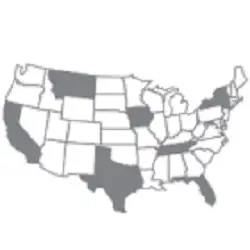
Correlations
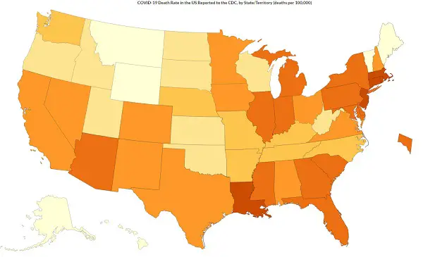
between States with High Coronavirus Mortality Rates The CDC maintains a map of the U.S. showing the mortality rates (how many people per 100,000 of population) died from Coronavirus. The map at right is a snapshot from August 26, 2020.
This allows us to compare the death rates from Coronavirus between states. Of course, as Dr. Birx stated months ago, coroners were instructed to attribute any death to Coronavirus as long as the virus was detect in the person or there was even a suspicion that the victim had Covid19. This means the total number of fatalities attributed to Coronavirus are clearly exaggerated (it's like saying if you walked across the street and were hit and killed by a bus, and they detected the virus in your corpse's blood, you died from Coronavirus. )
But while the total numbers are exaggerated, the comparison between states should remove this and allow us to consider correlations to conditions that are likely causes.
Notice in the chart that the highest rates occur in states with:
See below for references for these facts.
Now, we accept that this is a correlation. Causation is not proven by statistical correlations, a fact often misunderstood by non-scientists.
But the authorities who are studying Coronavirus have already established a causal effect between specific underlying conditions (called co-morbidities), specifically::
 Obesity
rates by state
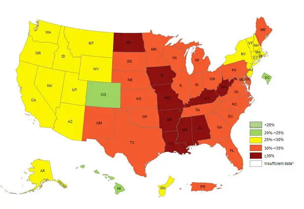
Obesity
rates by stateEach year CDC releases the Adult Obesity Prevalence Maps for all 50 states, the District of Columbia, and US territories. The maps show self-reported adult obesity prevalence by race, ethnicity, and location. The data comes from the Behavioral Risk Factor Surveillance System, an on-going state-based, telephone interview survey conducted by CDC and state health departments.
The 2018 maps show that obesity impacts some groups more than others. There are notable differences by race and ethnicity, as shown by combined data from 2016-2018:
Source: Health, United States, 2018, table 26 [PDF � 9.8 MB]
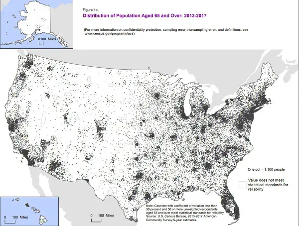
The U.S. Census Bureau shows us which areas have the highest populations of elderly people. Examining these maps at right, we see that again, it correlates to those states with the higher mortality rates from Coronavirus, with the exception of Montana, which has a very low population density being a very rural and sparsely populated state..

The Census Bureau also has population density maps, shown at right. Again, we see a high degree of correlation of the states with the highest mortality rates an d the states with the area of highest population density.
When you drill down to a county-by-county correlation between age and COVID mortality, the fit is very, very, close, implying that the virus spreads more when people are in close proximity, and this leads to higher death rates, as would be expected.
Ways to save money AND help the environment:
Save water AND money with this showerhead adapter, it lets the water flow until the water is hot, then shuts off water flow until you restart it, ShowerStart TSV Hot Water Standby Adapter

Protect your health with these:
Mattress Dust mite-Bedbug protector, 100% Waterproof, Hypoallergenic, Zippered
Handheld Allergen Vacuum Cleaner with UV Sanitizing for Allergies and Pet, Kills Mite, Virus, Molds, True HEPA with Powerful Suction removes Hair, Dander, Pollen, Dust ,
,
Immune Support Supplement with Quercetin, Vitamin C, Zinc, Vitamin D3
GermGuardian Air Purifier with UV-C Light and HEPA 13 Filter, R emoves 99.97% of Pollutants
HEPA Air Purifier, HEPA Air Cleaner with Washable Pre-Filter, AQI Display, ECO Mode, Sleep Mode, Pet Mode for Pets, Dust, Pollen, Removes 99.97% of Particles, Smoke, Mold, Pet Dander, Dust, Odors
Interesting Reads:
THE PREPPER'S CANNING & PRESERVING BIBLE: [13 in 1] Your Path to Food Self-Sufficiency. Canning, Dehydrating, Fermenting, Pickling & More, Plus The Food Preservation Calendar for a Sustainable Pantry
The Backyard Homestead: Produce all the food you need on just a quarter acre! P aperback
The Citizens' Guide to Geologic Hazards: A Guide to Understanding Geologic Hazards Including Asbestos, Radon, Swelling Soils, Earthquakes, Volcanoes
The Uninhabitable Earth: Life After Warming
Book: The Sixth Extinction:
An Unnatural History Paperback
 .
.